On failing to visualise web analytics
Perhaps you recognise this feeling: “If I could only go a little bit deeper into Google Analytics, I would finally get it.”
I feel it every time I look at a web analytics dashboard. By analytics I mean usage data: rate of requests, time of requests, etc.
I’ve always wanted to use these tools expose the system to my senses, not just my brain. I want to see users as individuals with whom I can empathise, and as crowds whose collective behaviour can surprise me.
So I decided to build a visualisation.
It didn’t work.
Pseudo-plaza
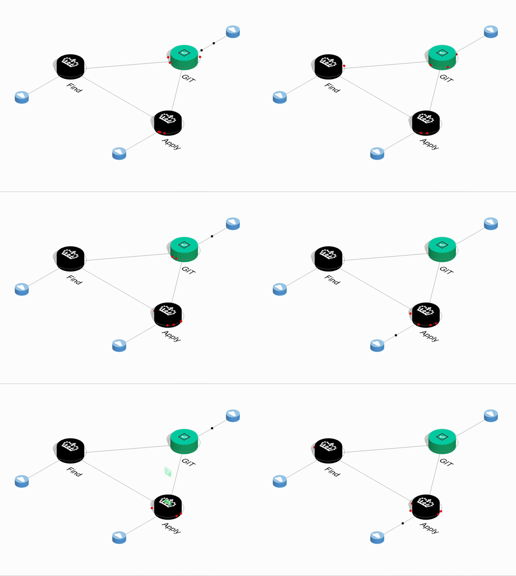
This is what I built.
One of the software systems I work with is all about teacher training in England. The purpose of the system as a whole is to recruit trainees onto teacher training courses.
This is what the visualisation looks like, as a GIF on a ~10-second loop. IRL it’s 3D and you can zoom and pan around it.

The black dots show traffic arriving from the internet (represented by the blue cylinders) and passing between the services. The red blobs orbiting the services show traffic moving from page to page on that service.
- Find is Find postgraduate teacher training courses.
- Apply is Apply for teacher training, which uses information from Find to build teacher training applications
- GIT is Get Into Teaching, our brochure website and general source of guidance on becoming a teacher.
The little green ticks you see flying off Apply show when a candidate has been recruited onto a teacher training course.
The data here is real and collected in real time from our internal analytics platform.
And everyone says it’s cool, but nobody asks to see it.
3D fallacy
Why isn’t it interesting?
My instinct was to create a space that reflected the “space” in the system. Call it a visual metaphor. My visual metaphor was the plaza.
 People in a plaza in Florence, Creative Commons via
pxhere.
But look at this real plaza. Look at its rich diversity! Look at all the different configurations of clothes and hair people and groups and roles and buildings and umbrellas!
From the point of view of my plaza built on analytics, pretty much all the information that makes the real plaza interesting is totally unavailable. You can’t follow people, or wonder why they go where they’re going, or stay where they’re staying.
The more I looked at my plaza the more I realised that this spatial metaphor that appealed so much was fundamentally wrong.
The system doesn’t really have a “space” to express.
For instance, service boundaries most closely reflect divisions of responsibility amongst teams. But why should those matter to users?
Indeed, with data only from the system, is it possible to visualise a space which isn’t just a system diagram?
What about the individuals themselves? What identity do they have in this plaza? How could I root for them?
And a quiet implication of the plaza metaphor is that things unfold before your eyes: sensory information arrives in real time. But is it right to look at the information in real time when the process can take weeks?
It presents as a birds-eye view, but really it’s an ants-eye view.
The edges of analytics
Why can’t web analytics show us our systems, and why do we persist in thinking it can?
I think the heart of the problem is that transactional web services, even though they exist for the sole purpose of collecting and disseminating information, and present as information factories, have two major constraints on the information they can collect.
- Firstly the information has a strict range. You have determined which interactions are possible in your system—which is the whole point of having a system in the first place!
- Secondly it has limited expressiveness. The limited range of interactions produce a very specific and very limited type of information, i.e. “data”. You cannot see, smell, hear, touch to or go amongst your data. You can’t talk to it. You can’t react to it. All you can do is push it around and think about it.
Take an applicant for teacher training. The services collect their degree, a few personal details, their work experience and a personal statement. But their decision to teach, their motivation, their reasons for their choice of subject, or training method, or training provider, or their likelihood of success, their chances of employment, their chances of staying in the job once they get there — to be clear, all the pieces of information we’d really love be able to glean from a system we take the trouble to operate — are all more or less out of reach of the raw facts we deal in.
So we turn to web analytics to enrich our understanding: so granular! so real-time! So lifelike! And we blame ourselves for not having done anything more interesting with it, and that we haven’t reconstructed a model which conveys those reality-like qualities of granular real-timeyness to our senses.
But it’s not our fault. Web analytics are altogether too thin to do that.
What can we do with web analytics
Firstly, we need to understand that web analytics are completely separate from the data our services collect. They are circumstantial evidence; indicators.
If we do want to use this information to help us frame questions about user behaviour, we need more radical thinking about how we present the data.
Specifically, we should embrace the thinness: reducing, not increasing, the granularity of the information we present.
Let’s say we removed every dimension but time. Every user who interacted with the system hung on a thread, like apples on a tree. Over time they would grow. If they ever converted, the apple would fall. You could see all the grown unfallen apples and ask why.
Or we could remove dimensions in space: make the journey 2D instead of 3D. Or even 1D. A point which pulses, and grows, and shrinks to changes in traffic and success rates—a heartbeat.
Or maybe a camera, but over the shoulder of a single user at a time, following them from screen to screen.
When information is extremely diffuse we shouldn’t be spreading it out. We should be condensing it.
Source code
If you would like to experiment with the visualisation itself, you can find the TypeScript source code here.